Saturday, December 27, 2008

Accidental Makeover


Before
After
We finished one bathroom before ever moving into the house. It was the upstairs bathroom, and we needed it to be done before we moved in so that we would have at least one place to shower and pee. We did it black and white and in a style that fit with the Craftsman look of the back of the house, and for some reason it didn't take long at all for us to choose the look. By contrast, the second bathroom took almost a year to design. It has been under construction for well over a month now, and as I write this the workers are prepping the walls for tiling.

The construction of this last bathroom became a bit more pressing when we realized we would need the adjoining bedroom to house our new au pair, Karina. By a near miracle, our contractor managed to close off her room from the bathroom construction just in time for her arrival — truly a photo finish. Karina slept in Poppy's bedroom her first two nights while the paint in her own room dried.

So, in finishing the bathroom, we managed to knock out another room in the process. This is the downstairs bedroom, and I think the pictures tell most of the story. What you can't see in the "before" pictures though is the smell. When I first came into this house, I was sure it was occupied by homeless people. This room in particular had a smell that packed a wollup.

Window before
Window after
And the closet still doesn't have any doors on it, but we're working on that. It's an unusually deep closet, so I'm still considering adding some shelving. I read an ingenius tip for a deep closet in some shelter magazine. You put shelves in the back half of the space and hang clothes from a bar in the front half. Then if you need something from the shelves, you just reach through the hanging clothes. I'd like to try it.

Closet before
Closet after
Here is a quick breakdown of this room:

We replaced the window with the same Superior vinyl windows in the color Almond that we've used in the rest of the house. The door next to the window is a vintage door from architectural salvage stained dark and the frame is Craftsman style but new. The door to the bathroom is a single-light white lami from Valley Sash & Door in Burbank. We chose a modern door here because the rest of the bathroom doors are modern, as is the bathroom itself. The door frame is Craftsman style — but you know it's new because there wasn't really a doorway there before — just an open walkway with shutters and apparently some curtains. The light is a George Nelson knock-off from the annual Modernica sale. The bookshelves are Ikea and have been with us since Richard Drive. That's a whole other blog posting. The rug is from Home Depot. I went there looking for some industrial strength, kid-proof floor protectors and came away surprised at how many cool rug styles they have. The rug is thrown over hardwood floors — which we discovered under the old owners' carpeting and refinished along with the rest of the house before we moved in.

And here, a final pic of the room in use:
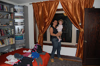
Karina, unpacking in her new room with Poppy, the day of her arrival.

Wednesday, December 10, 2008

Show Time

Before
You would think that being on maternity leave I would have all the time in the world to update my blog.

Doesn't exactly work like that.

In fact, I've been burning to post these pictures of our most dramatic makeover of all for a long time. Now that I'm about to return to work, I'm forcing myself to take advantage of Poppy's naptime to do something other than pick up toys.

Hard to believe it has been almost a year since I first spoke to the folks at the shoe "Desperate Spaces" on HGTV. I came across their casting solicitation on Craigslist while perusing the TV listings. We have some friends who have done well renting their house out for shoots, and I figured some producer somewhere must be trying to find a house that looked like a crack den to use in his/her production. Among the ads was one that said "Do you have a room in your house that is so bad it makes you feel DESPERATE?" And I thought to myself, take your pick. You could do a whole series on the rooms in my house that make me feel that way. So I answered the ad, and after a lovely visit from segment director Art, Jim and I found ourselves — and our office — accepted to the show. Within months our space would be getting a TV-style makeover.

I don't want to bore you with too many details, but here are a few that most people want to know when they hear we were part of a TV makeover. The show took 4 months to plan, but only 2 days to shoot — that's a full-blown makeover in two days. The budget for the room was supposed to be $2500, but we feel we got much more than that out of it. We were not only pleased with the result, we felt the whole process was very smooth and we had a good time doing it. The whole production team was very respectful of our home, and the designers went to great lengths to accomodate our desires. While we did not have a say in the final design, we were able to tell them about things we liked and disliked and challenges we were facing in desiging the room. They really came up with some interesting solutions. The production was pretty grand and made quite a spectacle of our house for those two days. For instance, here's how the front of our house looked during the shoot:
During
You'll find the "after" pictures below (remember, you can click on any image on this blog to see a much, much larger version of it), but here are just a couple things of note that they did: They took out the whole fireplace. That was huge. It wasn't a working fireplace, although there is a full-blown chimney on the other side of the wall. We think it probably got damaged in some long-ago earthquake, so they just sealed it up. It was a hideous hangover from the 60s, so good riddance. Here is a picture of the fireplace in process:
During
You'll also notice a brick wall in the "Before" Picture above (at the top of this post). That was not actually brick, but a faux brick — I don't even know what to call it — it was just faux brick that was hung on the wall. If you knocked on it, it actually rang hollow. Taking that out was one of the first things we did. You'll notice that the show replaced the 7 mis-matched bedposts that served as a stair railing with something much more cool and modern. And they hung a very heavy bookcase on the wall above our cold air return, making a wall that had previously been somewhat unusable (because you can't block a cold air return) suddenly usable again.

OK, 'nuff said. Let's get to looking at the after shots.
After

Just want to give a special thanks to the whole staff and crew of Desperate Spaces. The house really felt like it turned a corner after this re-do, and we are very appreciative. You can view just a tad more about this makeover on the HGTV Web site at http://www.hgtv.com/hgtv/shows_hdesp/episode/0,3183,HGTV_30737_59868,00.html.