Tree Hugger
Not all trees last for centuries. Even some of the ones that are meant to.
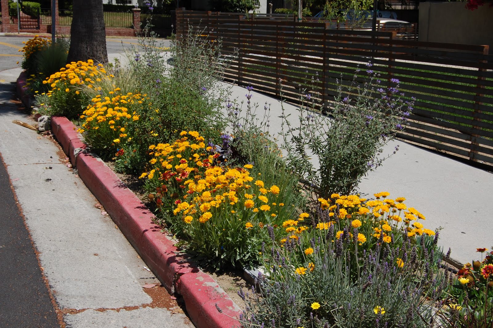
One real point of pride with me is the number of trees I've planted. Just as part of this renovation project, I've been responsible for the planting of six trees (seven if you count the pomegranate, which borders on being a very tall bush.) And really, can you think of any single negative thing about a tree? They are majestic, and provide life-perpetuating oxygen, and shade, and beauty and jeez I could go on. And to plant one is to bring all that into the world for potentially a century or more.
At least that's what I had in mind when I went in search of a willow tree for our front yard. A tree that would grow to be formidable in size, but with a soft, weepy embrace. The tree of choice for romantic comedies set in the Deep South.

"They're not native," they said. "They need a lot of water," they said. I got a lot of disparaging advice from professionals. Cut to me installing a lovely willow sapling in our otherwise low-water yard.


 Or like we're about to bury a small (but wide) coffin.

One real point of pride with me is the number of trees I've planted. Just as part of this renovation project, I've been responsible for the planting of six trees (seven if you count the pomegranate, which borders on being a very tall bush.) And really, can you think of any single negative thing about a tree? They are majestic, and provide life-perpetuating oxygen, and shade, and beauty and jeez I could go on. And to plant one is to bring all that into the world for potentially a century or more.
At least that's what I had in mind when I went in search of a willow tree for our front yard. A tree that would grow to be formidable in size, but with a soft, weepy embrace. The tree of choice for romantic comedies set in the Deep South.

"They're not native," they said. "They need a lot of water," they said. I got a lot of disparaging advice from professionals. Cut to me installing a lovely willow sapling in our otherwise low-water yard.

My hopes were high. I even took a picture of my son, who was just two at the time, next to the tree, because I had visions of him as an old man standing next to same tree reminiscing on his happy childhood climbing its branches.

And for a while the tree grew. And when I was really regular about deep soaking it like clockwork every two weeks, it did well. It came to be green. But there was one episode, which i don't have pictures of, when the tree came unbound from its supports and bent fully over. It really never recovered after that. It came to have an odd, unappealing shape and eventually, it died.

So, finally, we took the plunge and had the bad boy removed. Now it looks like a 5,000-lb. brick slammed into our front yard.


I'm hoping when I get home from work tonight, this hole will be history and a peppy pepper tree will begin its reach from this location toward the sky.
posted by Gabrielle P at
1:12 PM
0 Comments
![]()


_rev.jpg)